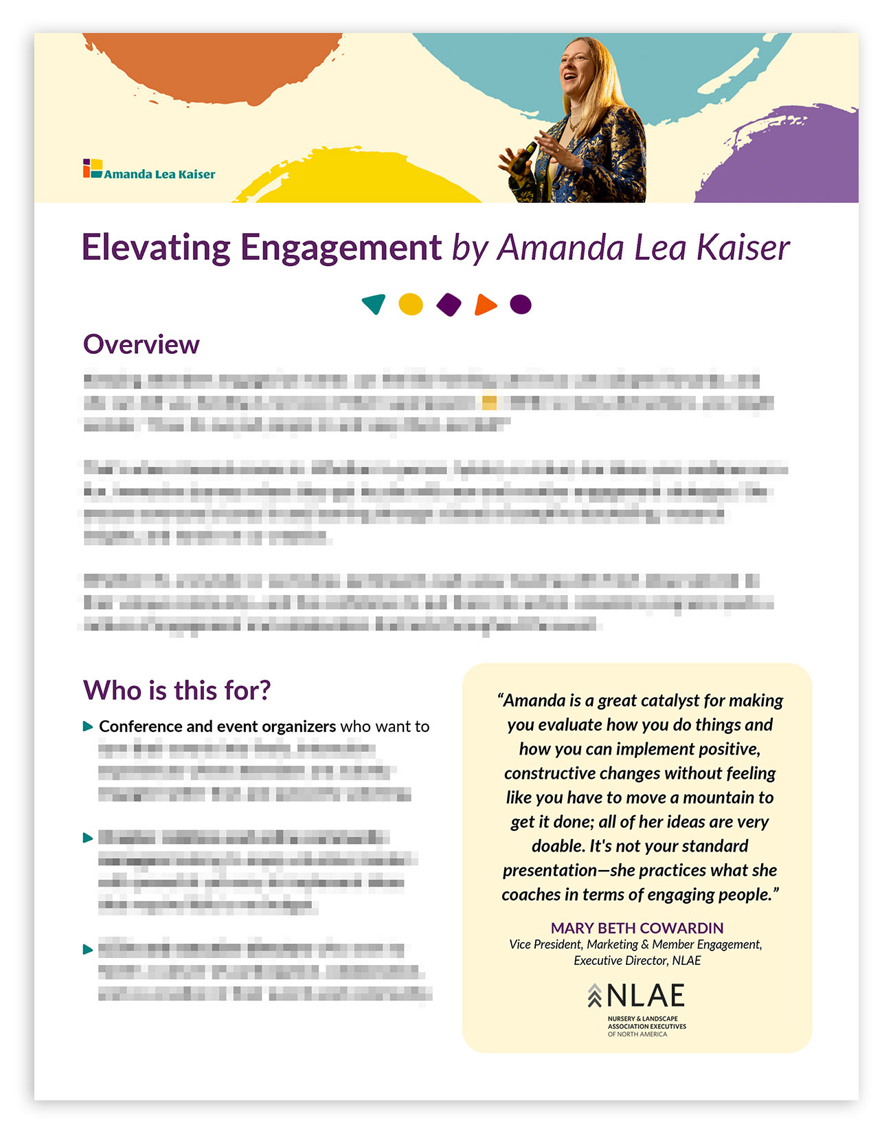


Above is a five-page custom, branded sell sheet design I built in Canva for my client, Amanda Kaiser. I've blurred out confidential information and shown content that is safe to share to help illustrate the design decisions made.
Amanda wanted a professional sell sheet that reflected her brand to review with her prospective clients at in-person meetings. She wanted the design built in Canva as this was not going to be a static document, and she wanted to be able to edit the content herself when needed.
I had used Canva in other ways up to this point but had not yet built a multi-page document such as this. I upgraded my subscription to Pro and dove right in, teaching myself how to do what I wanted on the platform to make this document as close to how I would have created it in InDesign as possible. As I was designing, I stayed mindful of Amanda's need to be able to edit the content periodically, and I aimed to make the design as "unfussy" as possible while creating a dynamic, engaging design.
Design decision details for each sample page are explained further below:
Above: First page/cover page. After several tries at a top-of-page banner image design, I tried a simpler approach that helped tie together the author page and last-page book callout. I used the colorful "dots" graphics from the book cover in the banner area on this first page.
I decided to use the yellow from the brand color palette throughout the piece to add warmth and allow for color that would contrast well with the bolder brand colors. The pale yellow background works well to place text and graphics over. It worked very well in the banner area to create movement and flow from one end of the banner to the other behind the clipping path image of Amanda presenting a keynote.
It was tricky finding images of Amanda on stage that were narrow enough to fit in this space, give the most visual information, and fill in the spaces to the left and right sides of the page. Clipping her from the background and layering her image over the colorful and flowing background was a successful solution and accomplished the important visual goals for that area, which are to catch the reader's eye, draw them in, be on-brand, and queue the reader to what Amanda has to offer the client.
I decided to incorporate three colors from the brand for headings, bullets, and graphics: purple, green, and yellow. The brand has a variety of bold, saturated colors, and I wanted to pare the usage down to a few to keep consistency throughout the document and not be overwhelming.
I created custom bullets using a rotation of the triangle shape in the brand flourish graphics. I intentionally rounded the corners of all the rectangles in the design except the "packages" table to compliment the rounded shapes in the brand graphics.
The pale yellow rectangles worked well for the testimonial call-out sections. It brought attention to the text, and the greyscale logos contrasted well with it.
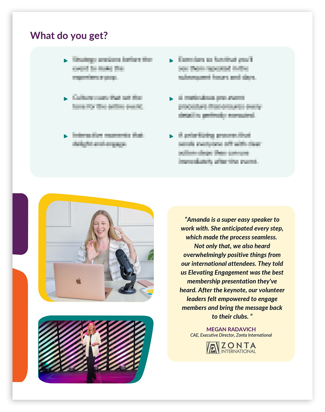
Above: Page two. I wanted to include images of Amanda throughout the pages to help the reader feel connected and help them visualize what it would be like having Amanda speak at their event. I used two shape elements from the shapes in the logo to insert images stylishly. These images of Amanda go so well with the testimonial from the representative of Zonta, directly to the right. It puts a face to the words, creating a connection to the content.
Above: Page three. Package offerings table using shades and tints of three brand colors, purple, green, and yellow for bullets, text, and backgrounds.
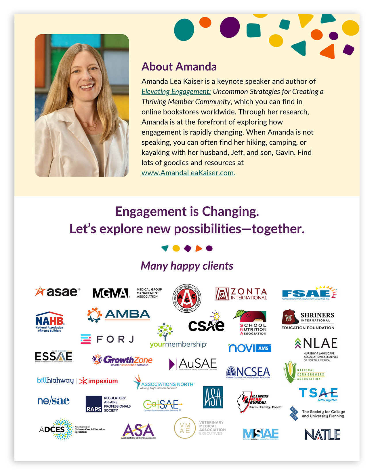
Above: Page four. I cleaned up over 30 logos, resized them, set them to RGB, and converted them to .png files. I created the collage by eye, balancing the white space around the logos.
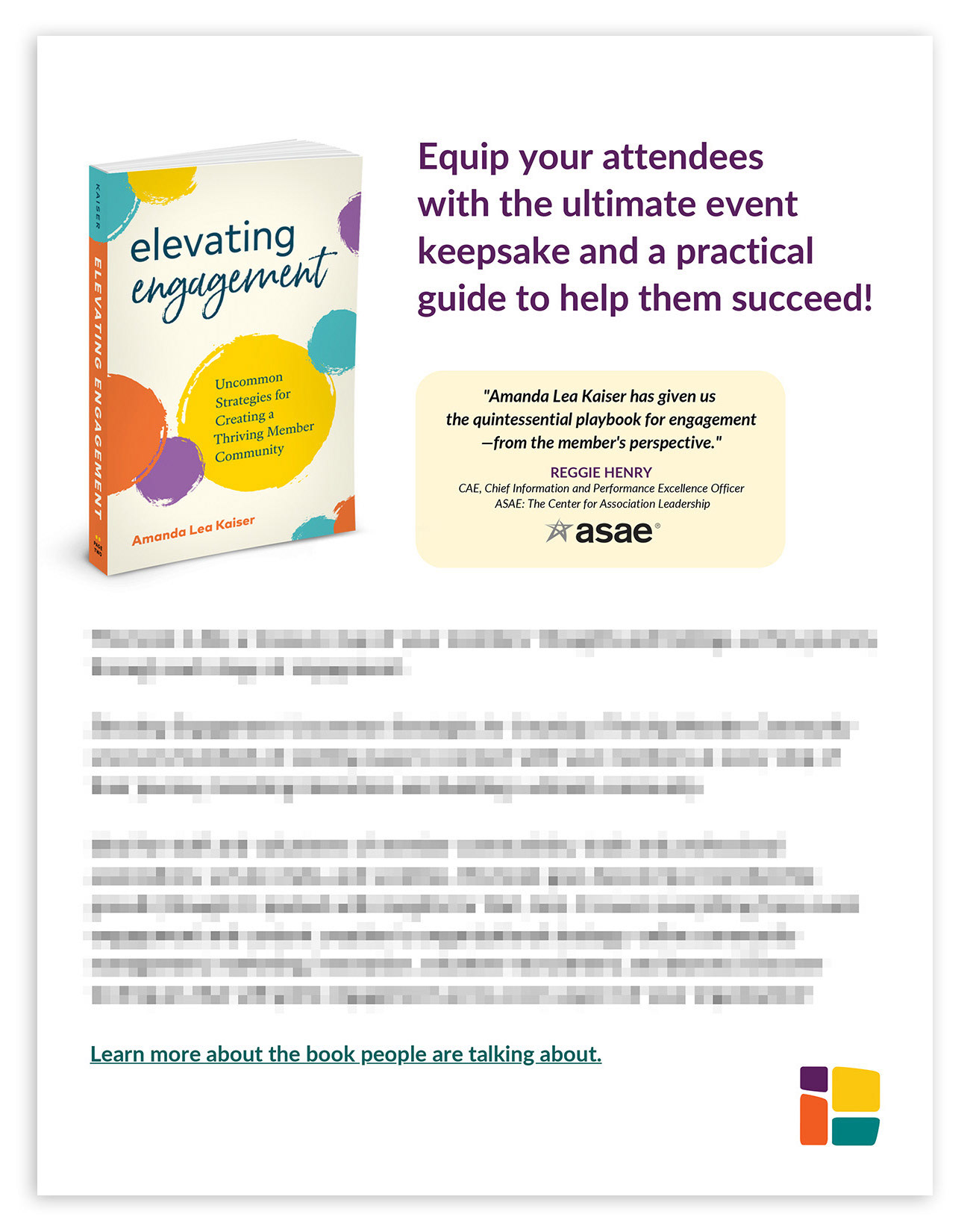
Above: Page five.