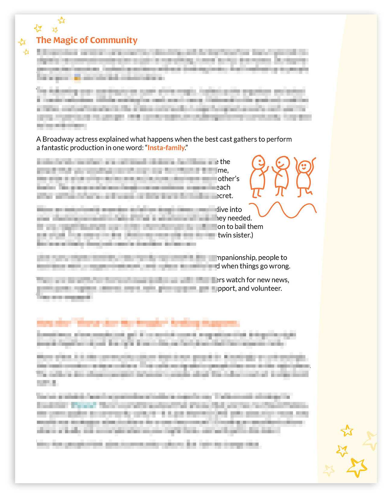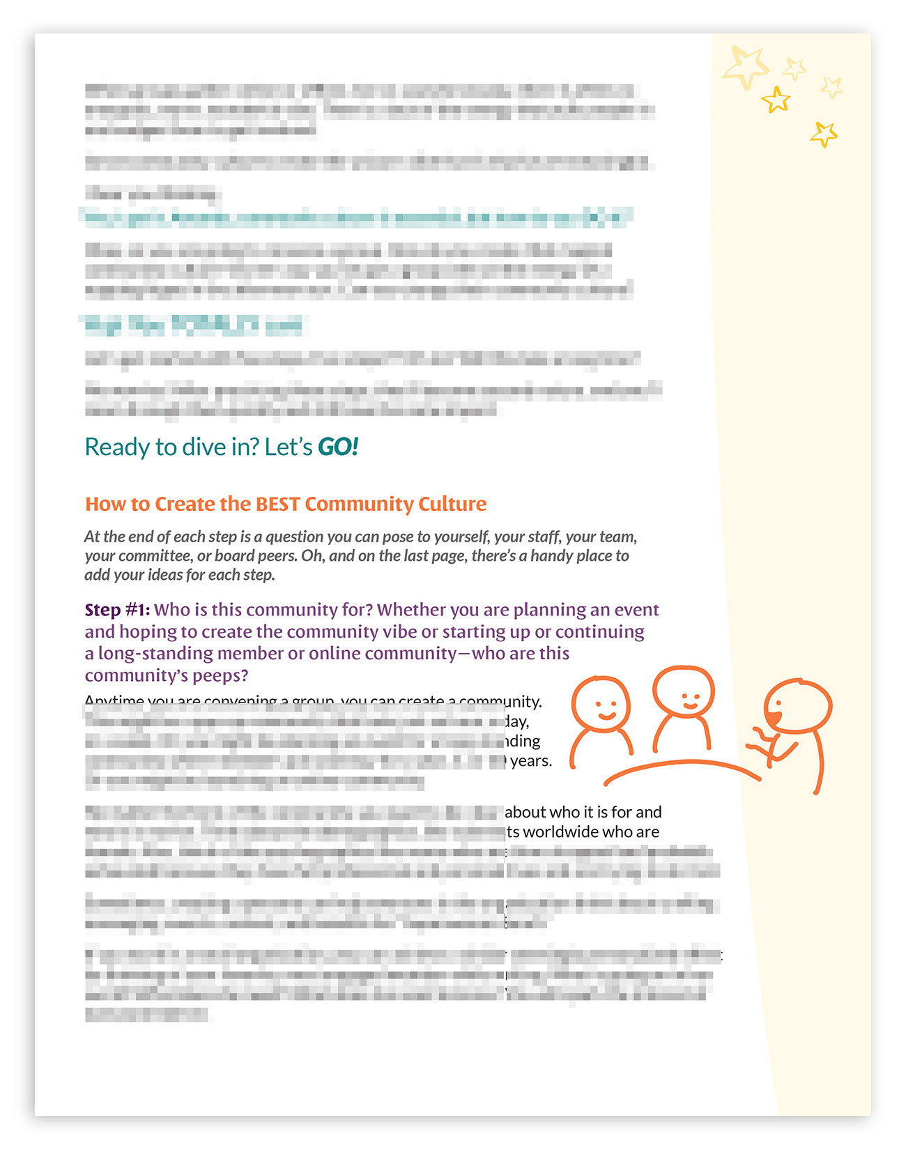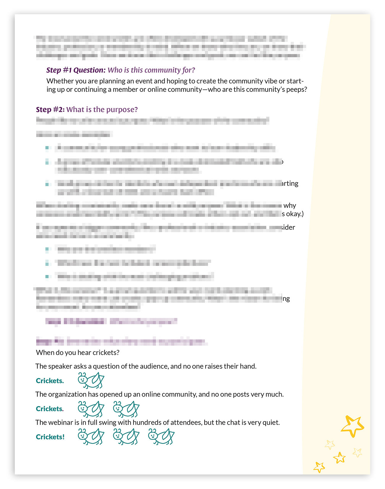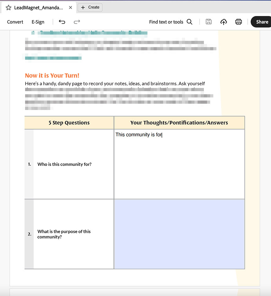


The above is a six-page sampling from the eleven-page custom digital lead magnet document PDF. From left to right: The cover, pages one, two, four, six, and ten. I've blurred out confidential information and shown content that is safe to share to help illustrate the design decisions made and how the artwork integrates with the content. Design decision details for each sample page are explained further below:
Above: Cover design. The client expressed her desire to create a professional piece that included the warmth and light-heartedness of her brand. She also wanted this piece to bridge the design of her website, book, Amazon book preorder workbook gift, and sell sheet design. Although all pieces of her collateral shared and followed her brand guidelines, some pieces focused more on certain elements than others, and/or had a slightly different tone from each other due to its purpose.
I decided to play with the curve shapes from her website to create an element that could be carried throughout the piece to not only border certain page information but also create movement from page to page. This idea worked on the cover to help create a hierarchy between the heading, author name, and subheading. It also helped to create a space that worked out for an ideal place to include artwork and the brand logo.
I decided to play with the word "sprinkle" in the subheading. I wanted to add texture to the cover design, so I created a pattern with some of the brand icons' star artwork designs and characters drawn by Amanda Kaiser. I designed the pattern with alternating sizes, rotations, and opacities to depict depth and movement.
Amanda commented that this design decision was "brilliant" and enthusiastically approved!
Above: Page one design. I incorporated the curve shape from the cover and rotated it to create a margin area to place a campfire icon graphic that coincides with the intro text story. I art-directed Amanda to draw a few new custom icons for this project. The campfire icon is one of the items requested. I decided to use the stars from the cover and the idea of "sprinkling" magic throughout the piece. I arranged the stars icons to represent embers flowing up from the campfire, which helped the eye move to the next page's content and the word "magic" in the heading. I chose to add warmth to the interior pages of the design by including the orange and pale yellow from the brand color palette.
Above: Page two. The "ember" stars from the first page have flown up to the top left of the second page to introduce and enhance the word "magic" in the heading. The curve shape continues to lend itself as a margin border where uniquely arranged groupings of five of the star icons appear as a flourish on each page throughout the document.
I found places in the content where I could call out key text to pair with Amanda's custom artwork to introduce visuals as a reading aid throughout the piece.
Above: Page four. This page starts the section where the reader will learn five in-depth ways to create the best community culture. Each step has introductory questions for the reader to consider while learning as they read on. I decided to introduce the brand purple for the step introduction text to differentiate it from the warm tones of the higher-level section heading text.
Above: Page six. Similar to page five, the brand purple is used to differentiate each step's introductory questions and reflection questions. The reflection questions are included in a table with form fields at the end of the document for the learners to enter their thoughts either digitally or print and write answers.
What I enjoy the most about this page is the section "When do you hear crickets?"
I had so much fun deciding how to best arrange the text in this section and play with the cricket art to complement this fun content area. I art-directed Amanda to draw the cricket art for this section specifically. I thought it would be so much fun to keep adding a cricket graphic to the response to each of the three lines of text where crickets were the response to being unsuccessfully able to connect with association members.
Amanda loved this graphic approach as a visual aid to this section's content!
Above: Page ten, the next-to-last page in the document. Amanda wanted a table-style layout to organize the area where the reader would enter their thoughts about each step's questions from the reading. Amanda intended for the readers to print the PDF document and handwrite their answers in this section. I offered an option for the reader to enter answers digitally by creating form fields in these sections. The learner can save their PDF file afterward and keep it for future reference instead of printing the document to handwrite their answers.
Amanda agreed to the usefulness of this option and I incorporated it into the InDesign file and final PDF document, which I also made accessible.