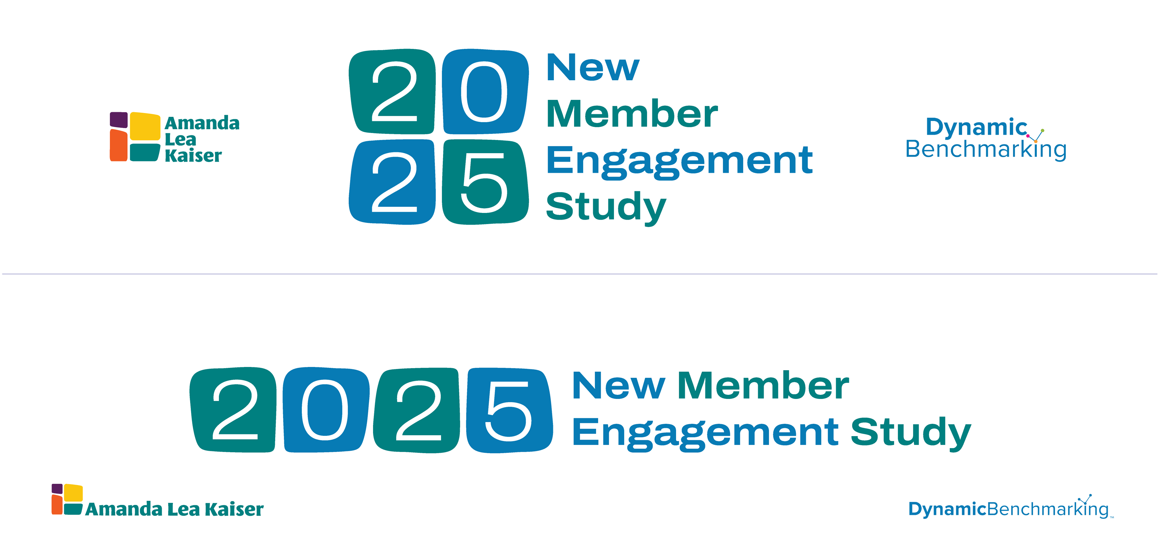
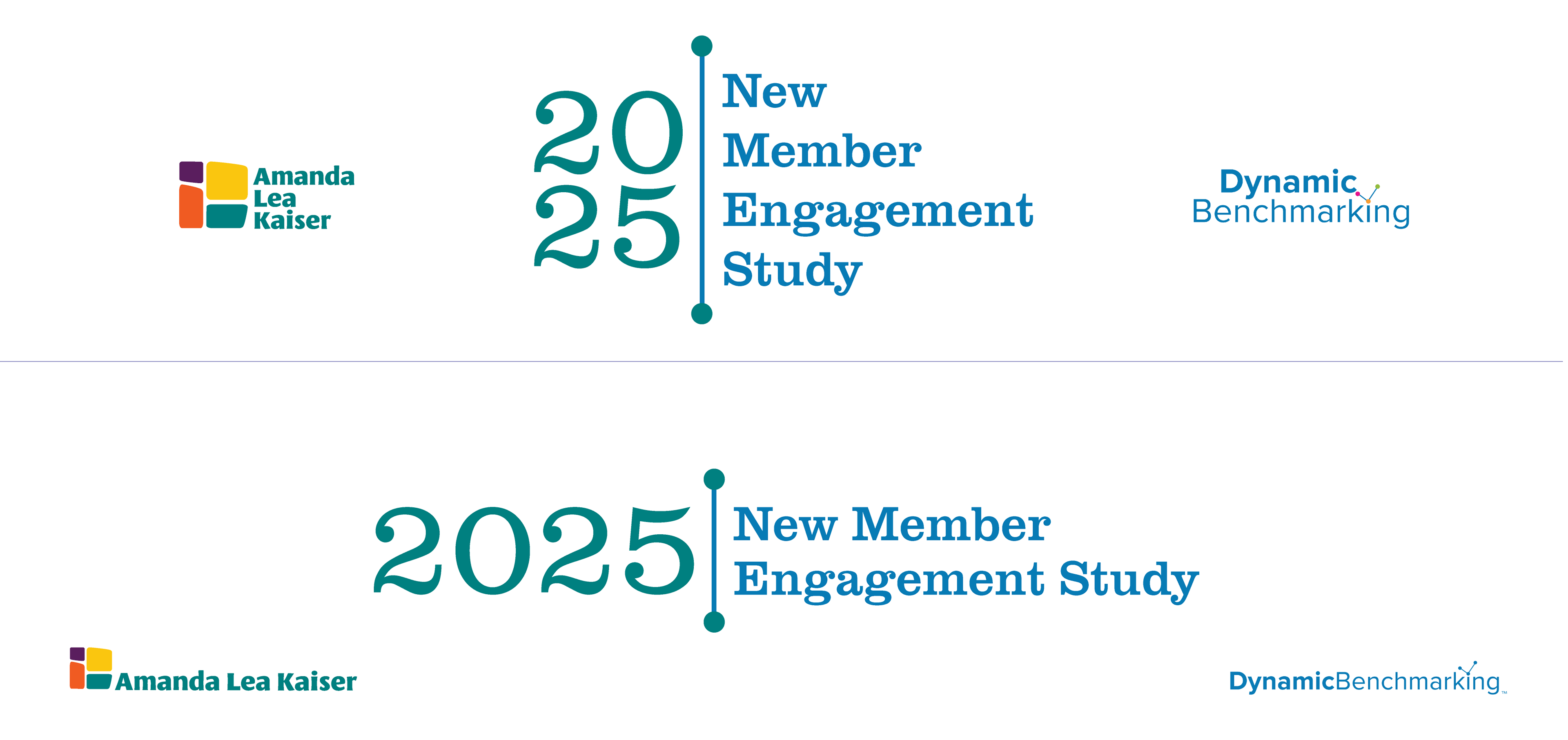
Above are examples of versions of the final, approved logo design arranged with the study writers' logos within a masthead layout. Amanda and Maria wanted a logo design that blended elements of each of their logos so that readers would understand that the study was a shared effort, while also wanting the logo to stand on its own since it is associated with a stand-alone product, the study.
Amanda approved the final design above, replying, "I love the way you integrated our logos - and the untrained eye might never pick up on that - brilliant!"
After providing Amanda with a few logo design idea options as a starting point to get a conversation going about what seemed to be working/not working, I was pleased to hear that this design was selected right away as is!
My idea behind this design was to take a prominent color from each of the partner logos that are similar in tone and use them in a balanced way so that it didn't seem that one or the other partner had more ownership of the study.
I selected Archivo SemiExpanded Regular typeface for the year and Clarendon URW Regular for the study title. I intentionally chose sans serif for the year and serif for the title to add formality and contrast between it and the year. I wanted the study title to use a completely different style typeface than Leksa, from Amanda's brand, and Proxima Nova, from Maria's.
Since there were no numbers in the Dynamic Benchmarking logo, using a sans serif for the year was "safe" because there was nothing to link it to each other, thereby maintaining equal ownership of the study between the two brands. Additionally, the Archivo typeface for Dynamic Benchmarking is much more narrow than the expanded typeface for the year, adding another level of uniqueness. The Clarendon typeface has uniquely different lettering styles, so again, there was no link between it and even Amanda's brand typeface, which has some stylization.
For a graphic element, I included the rule with dots on each end from the Dynamic Benchmarking logo, reworked to act as more of an alignment, anchoring, and hierarchy tool to help call out the year of the study and anchor the study title text. The need for an anchor element is most obvious with the four-line stacked logo variation.
Amanda and Maria wanted a logo design that would work as a single and multiple-line logo. They wanted a few different options that would best fit in many different layouts. The logo designs also needed to work when paired with the partner logos within two different masthead dimensions, 915px x 216px, and 949px x 224px, as these were the areas on the website where the introduction to the study document would be featured.
When I provided the final files to Amanda and Maria, I included versions of the mastheads shown above with Dynamic Benchmarking and Amanda Lea Kaiser logos swapped both ways so each had versions that put their brand first in the reading order when using the mastheads on their websites.
I also provided black and white versions of the logo designs for use over background colors and/or patterns that might make the study logo buzz or get lost. I also included the original .ai files and many vector and raster formats in CMYK, RGB, and high and low res, such as .jpg, .psd, .pdf, .eps, .svg, and .png for every possible need they may have.
I provided a few different logo design idea options as a starting point to get the conversation going about what seemed to be working/not working to hone in on the second-round design. Below are the other first-round ideas that I had presented:

